Premium fashion branding: when minimal identity actually sells

Minimal identity sells when every remaining detail earns its place, and the buyer can feel the quality in seconds.
Key Takeaways:
Minimal means edited, not empty.
One strong mark beats many competing details.
Premium is felt in fit, finish, and restraint.
Why minimal works, and when it fails
Minimal fashion branding looks simple, which is why it is often copied badly. A plain wordmark, a quiet colour, and a lot of empty space can look premium, or they can look unfinished. The difference is not the amount of design. It is whether each choice has a reason a buyer can feel.
A premium buyer reads quality fast: the weight of the fabric, the neatness of a seam, the spacing on a label, the calm of a store page. When identity, product, and packaging agree, that calm reads as confidence. When they disagree, the same calm reads as a gap.
A fashion brand identity design Noida team therefore tests identity against the real product, not against a mood board alone.
Minimal fails when it hides the story. If a buyer cannot tell what the brand stands for, who it is for, or why it costs more, empty space only adds doubt. Minimal works when the product, the price, and the promise are already strong, and identity simply lets them
speak.
What minimal identity actually contains
A strong minimal identity contains few elements, but each one is worked hard. The mark must read at small sizes, on a label, on a bag, and on a phone screen. The type must suit the buyer: calm and even for classic premium, sharper for modern premium. Colours are limited, usually two or three, and each one must work on fabric, on paper, and on screen.
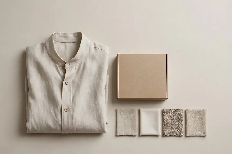
Photography carries much of the premium feel. Clean light, honest fabric texture, and room around the garment let the product do the talking. Busy props, loud patterns, and crowded layouts fight the garment for attention, and the garment usually loses. Restraint in photography is part of identity, not an afterthought.
Packaging completes the feeling. A plain box with a neat label, tissue that fits, and a clear care note feels premium. A busy box with many claims feels anxious. The buyer
opens the pack once, but remembers that feeling at the next purchase.
Where founders go wrong
The most common mistake is adding more to look more premium: more colours, more typefaces, more finishes, more claims. Each addition dilutes the one before it, until nothing stands out. Premium brands edit. They choose one mark, one voice, and one promise, and they repeat them with care.
A second mistake is copying a famous minimal brand without its product discipline. A quiet label cannot carry a garment that fits badly or finishes roughly. Buyers forgive a loud label faster than a rough seam. Fix fit and finish first, then let identity reflect them.
A third mistake is changing identity too often. Premium trust grows from repetition: the same mark, the same colours, the same tone, season after season. Small refinements are fine. Frequent reinvention tells buyers the brand itself is unsure.
A premium fashion brand identity case shows the same discipline: the identity serves the founder's story and the garments, it does not replace them. When mark, product,
and packaging agree, each new collection feels like a continuation, not a restart.
A simple test before launch
Before launch, test identity the way a buyer meets it. Show the label, the pack, and the product page together, without explanation. Can a stranger state, in one line, what the brand sells and who it is for? Can they find the price, the size, and the next step without hunting? Would they gift it as it stands?
If any answer is no, edit before spending on ads. Ads amplify identity; they do not fix it. A brand that passes this test can spend with confidence, because every rupee reaches a buyer who already understands the offer.
Comparison table
Busy premium attempt | Minimal identity that sells |
Many colours and typefaces | Two or three colours, one clear type |
Mark competes with product | Mark lets the garment lead |
Packaging makes many claims | Packaging states one promise neatly |
Identity changes each season | Same mark and tone, refined slowly |
Result is noise | Result is calm, trusted quality
|
Frequently asked questions
What makes minimal fashion branding look premium rather than plain?
Minimal branding looks premium when every detail is finished well: neat type, honest fabric photography, and packaging that fits the product. Plain branding looks unfinished when spacing, type, or finish is careless, because empty space exposes flaws. Premium comes from care in the few details that remain, not from the number of
Should a new fashion brand start with a minimal identity?
A new fashion brand can start minimal, provided its product, fit, and finish are already strong, because minimal identity cannot hide weak garments. A fashion brand identity design Noida team would test the mark against real garments and real packaging first. If the product is still unsettled, settle it first, then keep identity calm and clear.
How many colours should a premium fashion identity use?
Use two or three colours at most, so the identity stays calm across fabric, paper, and screen. Each colour must work in all three places, or it will look different on the garment, the pack, and the page. A limited palette also makes future collections easier, because new pieces fit the same system.
How important is packaging for a premium fashion brand?
Packaging is very important, because it is the first physical proof of the price the buyer paid. A neat box, a clear label, and a simple care note confirm the purchase, while a careless pack creates doubt at the moment of opening. Treat packaging as part of the product, not as an extra cost to cut.
Should a premium brand use a logo or a wordmark?
Either can work, provided it reads clearly at small sizes, on a label, on a bag, and on a phone screen. A wordmark suits brands built on a strong name, while a simple mark suits brands that need a symbol for small spaces. Test both at label size before choosing, because a mark that only works large will fail daily.
How often should a premium fashion brand refresh its identity?
Refresh slowly, with small refinements, rather than frequent reinvention, because premium trust grows from repetition. The same mark, colours, and tone, season after season, help buyers recognise and return to the brand. Change only what stops working, such as unreadable type or a colour that fails on fabric.
Does minimal branding work for bold fashion too?
Minimal branding can work for bold fashion, provided boldness lives in the garment, the colour, or the photography, rather than in a crowded identity. A calm mark and a bold garment balance each other, while a loud mark plus a loud garment compete. Let one element lead, and keep the rest quiet, so the bold piece stands out.
What should a fashion brand page show first?
A fashion brand page should show the garment clearly, with honest fabric texture, the price, the sizes, and one clear purchase step, in that order. Remove competing claims and long brand essays from the first screen, because a buyer decides fast. Add the brand story below, where interested buyers will read it.
How do we know minimal identity is working?
Judge minimal identity by repeat purchases, gift purchases, and buyer comments about quality and finish, not by likes alone. A working identity brings buyers back and makes the brand easy to recommend. Track which pieces and pages convert best, and keep the identity system that supports them.
What is the biggest mistake in premium fashion branding?
The biggest mistake is adding more design to look more premium, until colours, typefaces, and claims compete and nothing stands out. Premium brands edit: they choose one mark, one voice, and one promise, and repeat them with care. Restraint, backed by good fit and finish, sells more than decoration.
Closing
Minimal identity is not a shortcut. It is a promise that the product, the packaging, and the story have all been edited with the same care. When a buyer can feel that care in seconds, minimal stops looking plain and starts selling premium, season after season.


Comments